Download it
Download it here. You can visit the main page to preview base colors.
Reference the file inside the head tag:
<head>
  <link rel="stylesheet" href="ca.css">
</head>
Or you can include it in the HTML:
<style>[[ the whole output ]]</style>
Visual Studio Code
Grab CASS quickly through the Visual Studio Code extension. Install it in two minutes.
While in Visual Studio Code, launch VS Code Quick Open (Ctrl+P), paste the following command, and press Enter:
ext install casscss.CASS-viewer
After it's done installing, you'll be able to quickly access the CASS palette and CSS generator inside of Visual Studio Code by bringing up the command palette with Ctrl + Shift + P and typing "CASS."
Theming
Create a theme by overriding CSS custom properties:
:root {
    --font-size-base: 18px;
    --line-height: 2em;
    --text-measure: 58;
    --padding-base: .5rem;
  }
You can also just edit the variables that come with your CASS file directly, if that's easier. Just remember that when you swap in a new one, you'll be potentially losing those old settings.
Frequently Asked Questions
"What's the file size?"
About 20kb.
California Stylesheets are meant to be human-readable, not gzipped or tucked away in the JS or otherwise obscured from the user.
It's not a minimalist microframework or an entrenched all-style solution. It's a middleweight CSS file for people who need to give structure and style to a page fast, all while maintaining a site's style standards along with strong typography conventions.
"If it's not a framework, what is it?"
It's a really good base CSS file for any page or project, easily customized to fit any base color.
"Is it better than other CSS frameworks?"
It's easier to use. Sometimes it can do more and sometimes it can't. It doesn't require you to install npm, to preprocess anything, to post-process anything, to gzip, to tree-shake, to learn new words and abbreviations, or to burden your templates/views with new conventions outside of HTML.
It's not CSS-in-JS or pre-CSS or post-JS or anything like that. It's ca.css and you reference it in your HTML. Very lazy people just paste it into a style tag. We're cool with that approach.
"Should I switch from another CSS framework?"
CASS is aimed mostly at people who are frustrated with all the administrative overhead and process stuff that goes into writing CSS these days. If that sounds like you, try it out.
Even if you can't use CASS in your main project, it's a great tool for prototyping or for smaller satellite projects. CASS mostly plays nice with other CSS projects but very little care has been taken to namespace anything. (This may be an option in the future!)
"Are you sure this isn't CSS-in-JS?"
It's not CSS-in-JS. It's more like CSS-in-HTML.
"And it's not a preprocessor?"
It's not. CASS is a language of sorts unto itself, but it plays out entirely within the class="" part of an HTML tag. There's no compiling or processing step.
On the contrary, CASS is all about avoiding preprocessing or treating your CSS in any way.
"I don't know CSS. Can I use CASS?"
Of course! That's basically the whole point.
All you need to use California Stylesheets is knowledge of how HTML works. If you can put together HTML elements and add classes to those elements, you're ready to use get started.
In fact, CASS is a great way to learn CSS, because so many of the classes and conventions use names and terms from CSS.
"Wait, the point is writing less CSS?"
The point is to cover about 95% of a site's basic design needs and to write about 90% less CSS overall, yes. The composable classes based on standards do most of the boring parts of design and layout for you. With CASS, the remaining CSS that needs to be written is the last 5%-- the fun 5% that really makes a page stand out. The fun part.
"What makes it easier?
Conventions and simplicity. You probably already know all the words and abbreviatons in CASS (because there are no abbreviations). CASS follows these rules:
- No numerals (1, 5, 100, etc)
- No abbreviations (xt, MGS, xt:phablet-xxt)
- If it already exists, use that word
- "No" is powerful, and overrides other classes
- One- or two-word shortcuts to everything useful
"I don't know Cassandra. Can I use CASS?"
California Stylesheets has nothing at all to do with Cassandra DB. That came out wrong. We're sure they're great. It's a backend thing, right?
Composables
Composables are a bit like a language that plays out entirely within class="" in an HTML element.
CSS classes (typically noted in bold) are composed together in phrases to give shape and meaning to elements.
Here's a red test div:
A red padding div:
A red padding margin-bottom div:
A big red padding margin-bottom div:
A big card width red padding margin-bottom div:
A big card width red padding margin-auto margin-bottom div:
And finally a big card width dark red padding margin-auto margin-bottom rounded shadow div:
The term "composable" can be short for "composable CSS class" or "composable CSS phrase," so just one class or a handful.
Text measure
The composable type width uses the standard text measure. Text measure is how many characters fit on each line. This paragraph is set to this standard text measure.
A smaller version of the same concept is card width, which works well for pull-out quotes, notations or other smaller blocks of text.
Each content width concept also has a corresponding inner width version which enforces the width inside the element using padding.
This paragraph is card inner width.
<p class="card inner width">This paragraph is card inner width.</p>
The inner width composables compose with padding.
Both forms work: page inner width and inner page width have the same effect, because the order doesn't matter in composing CASS.
Adjusting font size
small
Make type smaller (.9x):
This is a small paragraph.
<p class="small">This is a small paragraph.</p>
medium
Make type the default size, usually as an override:
This is a medium paragraph.
<p class="medium">This is a medium paragraph.</p>
big
Make type bigger (1.25x):
This is a big paragraph.
<p class="big">This is a big paragraph.</p>
huge
Make type huge (1.5x):
This is a huge paragraph.
<p class="huge">This is a huge paragraph.</p>
headline text
The composables work on headline text too:
Whoa.
<h1 class="huge">Whoa.</h1>
Helper classes
text-center
Center text:
Centered.
<p class="text-center">Centered.</p>
text-padding
Give text padding, which is great for colored backgrounds:
This text doesn't go right to the edge.
<p class="text-padding red">This text doesn't go right to the edge.</p>
text-margin
The same as text-padding, but applied to margin:
This paragraph has a slight margin.
<p class="text-margin red">This paragraph has a slight margin.</p>
text-shadow
Gives the standard shadow to text.
This paragraph has a shadow.
<p class="text-shadow">This paragraph has a shadow.</p>
Text effects
Make text bold, italic, or underline with the corresponding composable classes.
<span class="bold">bold</span>, <span class="italic">italic</span>, or <span class="underline">underline</span>
Font families
CASS's font stacks are designed to use system fonts, or in other words designed to already be on the user's computer.
sans-serif
Lorem ipsum dolor sit amet, consectetur adipiscing elit. Donec eu bibendum urna, eget volutpat arcu. Donec consequat eros purus, vel ultricies libero dictum et. Sed tempor turpis in ipsum iaculis viverra. Donec vitae auctor urna.
<p class="sans-serif">Lorem ipsum dolor sit amet, consectetur adipiscing elit. Donec eu bibendum urna, eget volutpat arcu. Donec consequat eros purus, vel ultricies libero dictum et. Sed tempor turpis in ipsum iaculis viverra. Donec vitae auctor urna.</p>
serif
Lorem ipsum dolor sit amet, consectetur adipiscing elit. Donec eu bibendum urna, eget volutpat arcu. Donec consequat eros purus, vel ultricies libero dictum et. Sed tempor turpis in ipsum iaculis viverra. Donec vitae auctor urna.
<p class="serif">Lorem ipsum dolor sit amet, consectetur adipiscing elit. Donec eu bibendum urna, eget volutpat arcu. Donec consequat eros purus, vel ultricies libero dictum et. Sed tempor turpis in ipsum iaculis viverra. Donec vitae auctor urna.</p>
monospace
Lorem ipsum dolor sit amet, consectetur adipiscing elit. Donec eu bibendum urna, eget volutpat arcu. Donec consequat eros purus, vel ultricies libero dictum et. Sed tempor turpis in ipsum iaculis viverra. Donec vitae auctor urna.
<p class="monospace">Lorem ipsum dolor sit amet, consectetur adipiscing elit. Donec eu bibendum urna, eget volutpat arcu. Donec consequat eros purus, vel ultricies libero dictum et. Sed tempor turpis in ipsum iaculis viverra. Donec vitae auctor urna.</p>
Like any CSS, California Stylesheets will work fine with web fonts. The font stacks can be edited in their corresponding CSS custom properties in the typography section at the top of any California Stylesheet. Add your favorite fonts to the top of the stack.
Changing text color
text-color
Use the .text-color composable with any color class to specify that you want to color the text, not the background.
A red headline
<h1 class="text-color red">A red headline</h1>
Dark gray paragraph text makes for de-emphasized but still readable text.
<p class="text-color dark gray">Dark gray paragraph text makes for de-emphasized but still readable text.</p>
Bold red paragraph text may elicit memories of grade school grammar teachers.
<p class="text-color red bold">Bold red paragraph text may elicit memories of grade school grammar teachers.</p>
A very dark gray headline with a blue span
<h3 class="text-color very dark gray huge text-crunch">A very dark gray headline with a <span class="text-color blue">blue</span> span</h3>
Basic layout
Most layout goals can be achieved with the two columns and three columns composables, and some basic width composables.
Two columns:
<section class="two columns">
    <div></div>
    <div></div>
</section>
Three columns:
<section class="three columns">
    <div></div>
    <div></div>
    <div></div>
</section>
Make it use the tablet breakpoint: three columns tablet.
Or the desktop breakpoint: three columns desktop. Everything below the breakpoint will display as a stacked single column.
Setting content width
Use page width and inner page width to make the width of the div or the width of the div's contents fit the standard CASS content width. If your content is just text, try type width and inner type width. With these composable classes and margin-auto almost any basic layout can be put together.
Grid layout
The .columns and [number] classes make for a simple, easy-to-use grid system based on CSS's grid system. The numbers are spelled out. There aren't any numerals in CASS's composable class names.
The grid is based on a twelve-column grid:
To get a desired width, the wide composable is used:
A simple column layout is achieved by finding a good pair of numbered classes.
These examples use the .gap-text-padding composable which sets the gap to the project's base text-padding.
Alternate column schemes
The columns composable composes with four, five, six, seven, eight, nine, ten, eleven, and twelve (the default) to support the corresponding column schemes.
<div class="five columns">
    <div class="two wide">two wide</div>
    <div class="three wide">three wide</div>
</div>
<div class="four columns">
    <button class="dark red">
        Option 1
    </button>
    <button class="dark green">
        Option 2
    </button>
    <button class="dark blue">
        Option 3
    </button>
    <button class="yellow">
        Option 4
    </button>
</div>
The two columns and three columns composables work on their own, without the grid composable.
A narrow sidebar
Here's a standard sidebar layout:
<div class="columns gap-padding">
    <div class="nine wide base text-padding">
    .nine wide
    </div>
    <div class="three wide base text-padding">
    .three wide
    </div>
</div>
Helpers
Helper classes are available to fine-tune the grid. Each one sets the gap to a different project value. By default, it's set to the project's padding.
- gap-text-padding
- gap-text-margin
- gap-margin
- no-gap
More examples
Widths
Width classes set the width of an element.
- type width: The base content width, based on the --text-measure variable.
- card width: A smaller supplemental width, golden to type width
- page width: The page width, like type width and card width added together
- responsive width: 100%, type width and page width on mobile, tablet and desktop
These classes are often used for the basic layout framing of a page. They work well with margin-auto, which will center them in their parent container.
Inner
Add inner to width for an inner width effect.
- type inner width: Enforces text measure inside an element
- card inner width: Enforces the smaller text measure/width of an aside
- page inner width: On very large elements, sets the inner width to the full page width
- responsive inner width: Automatically sets an appropriate inner width
This example page is already set to inner type width, limiting our room, so we'll use the smallest of the three, card width, for examples:
This is just a regular teal paragraph with the padding composable added to it.
<p class="teal padding">This is just a regular <strong>teal</strong> paragraph with <strong>responsive</strong> and <strong>padding</strong> composables added to it.</p>
The same composables, but with card inner width added.
<p class="teal padding card inner width">The same composables, but with <strong>card inner width</strong> added.</p>
This one instead has card width and margin-auto.
<p class="teal padding card width margin-auto">This one instead has <strong>card width</strong> and <strong>margin-auto</strong>.</p>
Inner width composables work with the grid composables. This column of text, for example, has the inner type width composable on a nine wide element. In cases where the grid width goes above the text measure, the text inner width composable will enforce it.
Inner width classes help cut down on markup complexity by letting you use fewer containers.
Breakpoint helpers
There are three breakpoint helpers for responsiveness:
- mobile
- tablet
- desktop
Adding these helpers to any layout composable will dictate the screen width breakpoint for the layout composable's behavior.
Here's how two columns appears on the three different resolutions:
On mobile:
On tablet:
On desktop:
Here's two columns mobile:
On mobile:
On tablet:
On desktop:
The mobile and tablet composables compose with each other in two columns mobile tablet:
On mobile:
On tablet:
On desktop:
Here's two columns tablet:
On mobile:
On tablet:
On desktop:
Finally, here's two columns desktop:
On mobile:
On tablet:
On desktop:
Mobile-first
Breakpoints generally work with a mobile-first dynamic. The exception, appropriately, is "mobile" which is like saying "mobile-only" in terms of where and how it behaves.
A two columns composable will by base always appear as two columns, unless used with tablet or desktop.
Text-relative
Breakpoints aren't defined in prescriptive pixel widths. Instead, they're based on text measure, expressed in rem, and will change depending on text settings.
Using colors
Color classes by default change the background color of an element.
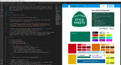
Every composable color class is based on the @base, the color you give CASS. Here are the palette colors:
Your base is a color in the palette too and can be modified by other composable classes like the others.
Powering the text colors, black and white are also included along with gray.
Examples
Give elements color by adding a color class:
<button>
A button!
</button>
<button class="red">
A button!
</button>
Light, bright, dark and dim
Color classes compose with the light, bright, dark and dim classes. These are the four main color variants.
Since these are driven by CSS variables, their children may need to be reset with the default composable.
<button class="light green">
A button!
</button>
<button class="bright green">
A button!
</button>
<button class="dark green">
A button!
</button>
Try different color composable combinations to give your pages and components the right look and feel.
Contrast overrides
Most text contrast works by default in CASS. Adverbs and helpers however can occassionally push a color outside of contrast standards. In this case, use tint or shade for white text and black text respectively.
This is a teal paragraph with the shade class.
This is a teal paragraph with the tint class.
For alternate classes in more of a web developer vein, text-black and text-white also work.
Utilities
- margin-auto: Sets margin to margin: 0 auto
- padding: Add padding to an element
- margin: Add margin to an element
- gutter: Add gutter (2x margin) to an element
- text-padding: Add text-padding to an element
- text-margin: Add text-margin to an element
- text-trim: Set line-height to 1
- text-crunch: Sets a condensed line-height
- text-center: Sets text-align to center
- text-left: Sets text-align to left
- text-right: Sets text-align to right
- text-rounded: Like rounded, but smaller for text
- block: Sets an element to display: block
- inline: Sets an element to display: inline
- gap-padding: Sets gap to padding
- gap-border-width: Sets gap to border-width
- gap-text-padding: Sets gap to text-padding
- gap-text-margin: Sets gap to text-margin
- rounded: Sets the border-radius to the default
- shade: Makes the text black (or dark, with text-color)
- tint: Makes the text white (or light, with text-color)
- hidden: hidden on all breakpoints (like hide but not composable)
- viewport height: Sets an element to viewport height
- clearfix: clears floats
Composable phrases
When you use CASS, certain composable phrases will come up again and again. Here are some useful ones:
- page width padding margin-auto: sets to page width with padding, and centers
- two column golden tablet: a golden-ratio two column container that breaks on tablet
- thick border border-text-color: a thick border the same color as the text
- hide mobile tablet: hides on mobile and tablet
- text-padding margin-bottom [color]: gives a color, padding and bottom-margin to an element
- inner card width text-crunch: smaller line height and width
- responsive inner width padding: automatically determines inner content size and padding
Hiding and fixing elements
The hide composable class hides elements. The fixed composable class fixes them to the page.
They both just work everywhere until you use one of the breakpoint composable classes with it: mobile, tablet or desktop.
mobile: the behavior happens only on the smallest viewport.
tablet: the behavior happens on mid-size viewports and up.
desktop: the behavior happens on the biggest sized viewports (and up).
Both mobile and tablet also compose with each other to trigger the behavior on mide-sized viewports and down.
For a composable like hide that doesn't compose with responsive classes, try hidden.
Nullifiers
Nullifiers start with "no-" and cancel out other rules.
- .no-padding-top
- .no-padding-right
- .no-padding-bottom
- .no-padding-left
- .no-margin-top
- .no-margin-right
- .no-margin-bottom
- .no-margin-left
- .no-padding
- .no-margin, .no-gutter
- .no-wrap
- .no-box-shadow, .no-shadow
- .no-text-shadow, .no-shadow
- .no-border-radius
- .no-border
- .no-border-top
- .no-border-right
- .no-border-bottom
- .no-border-left
- .no-background
- .no-caps
- .no-bold
- .no-overflow
- .no-overflow-x
- .no-text-indent
- .no-text
- .no-underline
- .no-user-select
- .no-click
- .no-pointer-events
- .no-list-style
- .no-gap
- .no-press